
08. Home Page
Go to Content Manager → Page → Home.
The Home Page uses the one-column page layout and the Primary Page Shell. The Standfirst field exists in the CMS but is not rendered when the page uses the one-column layout.
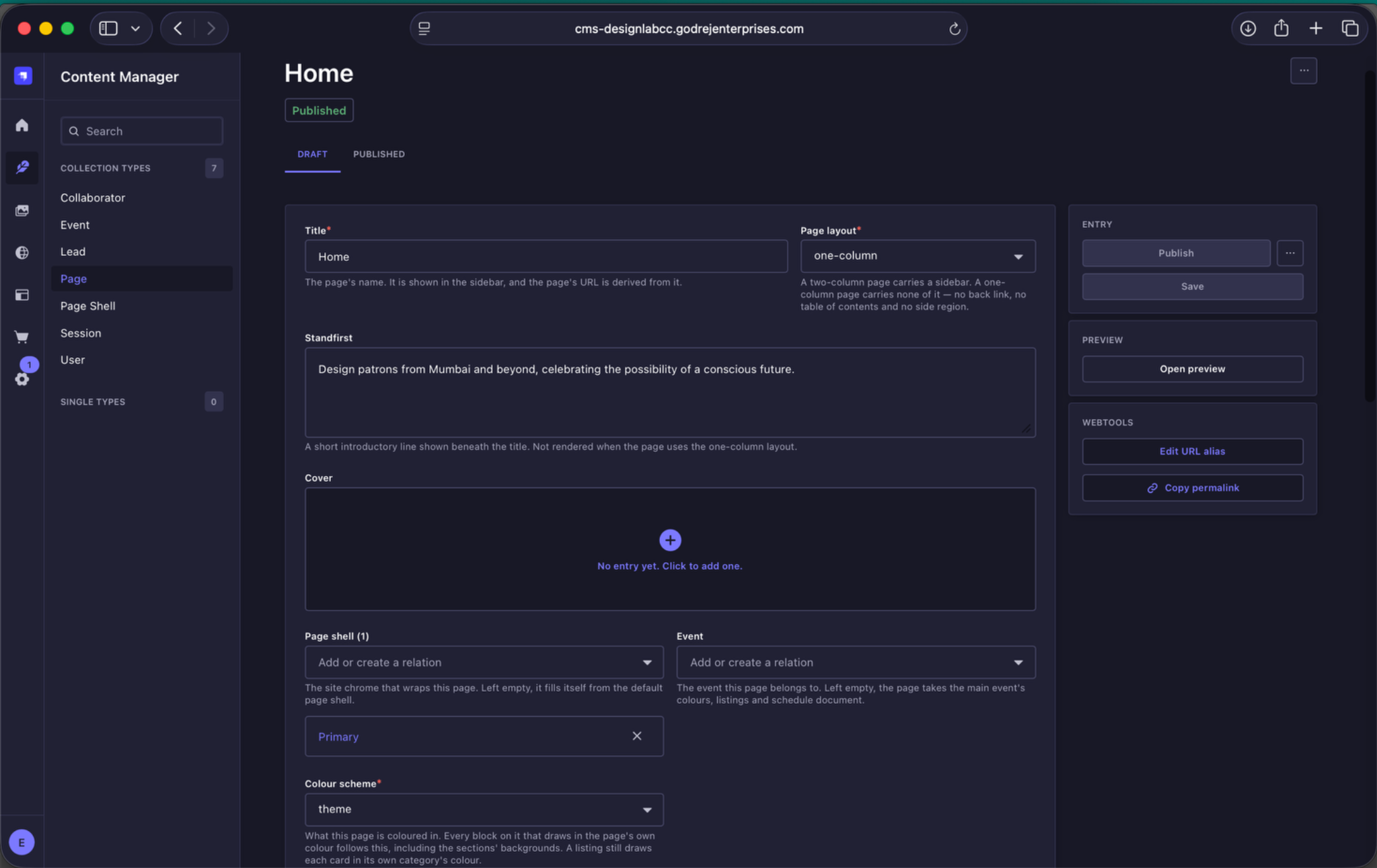
Home Page settings. Home uses the one-column layout and Primary Page Shell. Event can be left empty if the page should inherit the Main Event colours, listings and schedule document.
8.1 Section Order
The Home Page is made up of a fixed sequence of sections. Keep this order unchanged.
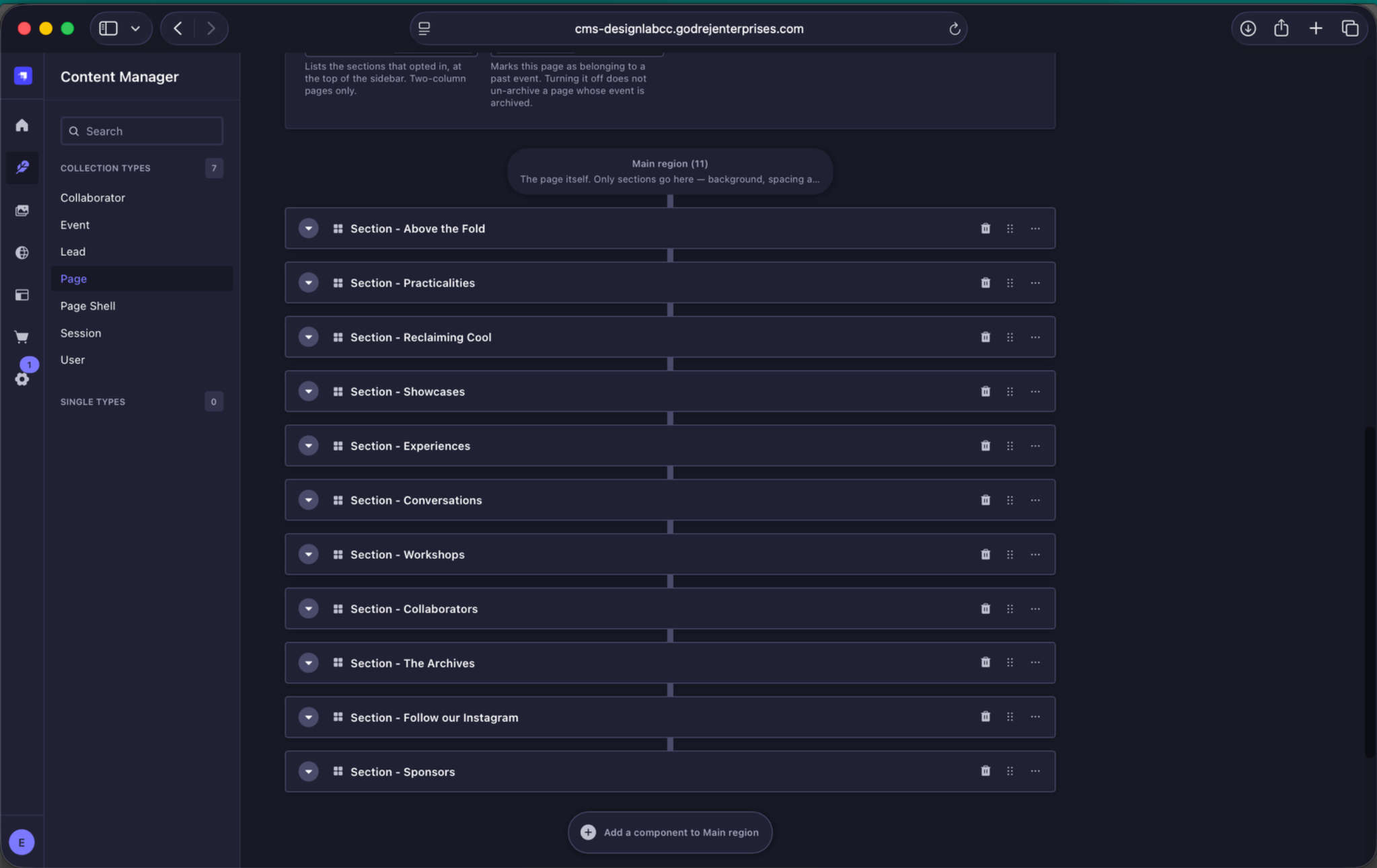
Home Page section order. Keep the sections in this sequence. Strapi allows drag-and-drop reordering, but the order is part of the website design.
- Above the Fold
- Practicalities / Marquee
- Theme for the Year
- Showcases
- Experiences
- Conversations
- Workshops
- Collaborators
- The Archives
- Follow our Instagram
- Sponsors
Do not reorder these sections. Their sequence is part of the Home Page design.
8.2 Above the Fold / Key Visual
Open the Full-bleed image component and replace the key visual for the new annual edition.
This is one of the few places where two different image crops should be uploaded because mobile and desktop use different aspect ratios.
| Small Screens / mobile | 780 × 1170 px, JPEG, 2:3 |
| Medium & Large Screens / desktop | 2880 × 1440 px, JPEG, 2:1 |
| Desktop safe area | Keep the bottom 128 px of the uploaded desktop image clear of important text, faces, logos and focal elements because the marquee overlaps this area. |
| Upload rule | Upload the mobile crop under Small Screens and the desktop crop under Medium Screens. Use Large Screens only if a different large-screen crop is required. |
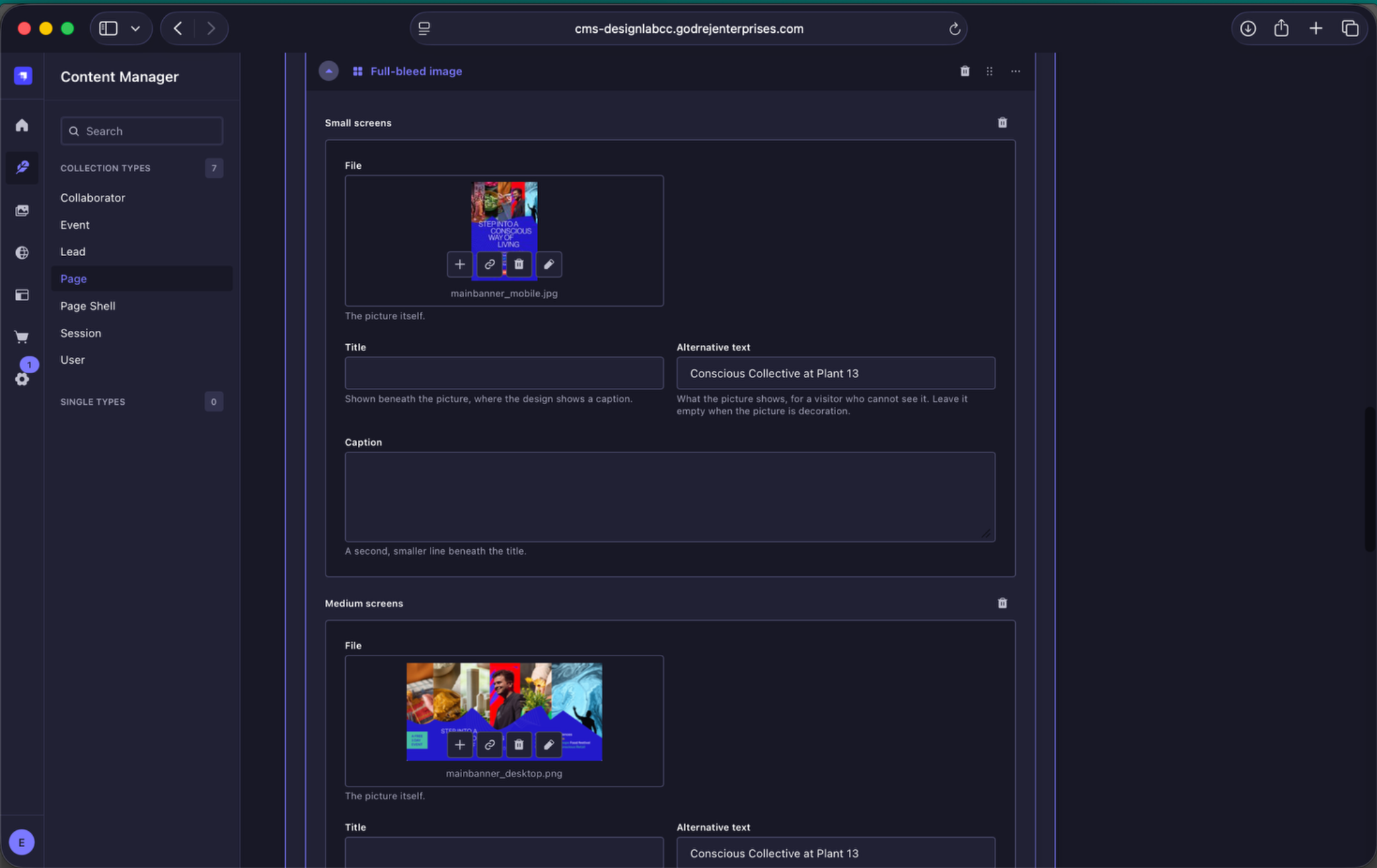
Key visual image fields. Upload a dedicated mobile composition under Small Screens and a separate desktop composition under Medium Screens.
8.3 Practicalities / Marquee
The Practicalities marquee is used for the venue, event dates and opening hours. For routine yearly updates, the two visual controls you need are:
- Background Colour - choose either black or white.
- Text Colour - choose Automatic, context, theme, black or white for each marquee item.
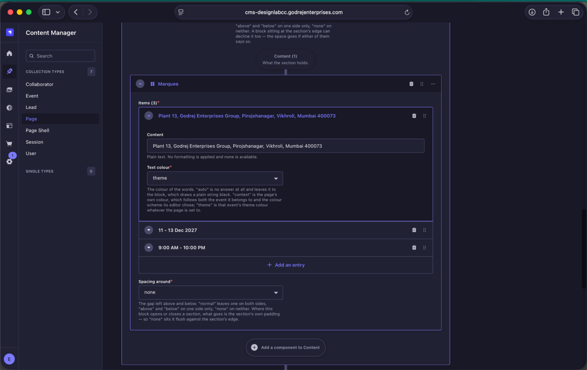
Practicalities marquee colour controls. Set the marquee Background Colour and choose the appropriate Text Colour for each item.
8.4 Theme for the Year
The Theme for the Year section introduces the annual theme. Update the existing section rather than rebuilding it.
The background pattern itself is not something editors can replace from the CMS. For each annual edition, the approved pattern needs to be prepared in both a dark and a light version and supplied to the development team, who will plug it into the backend.
Once that year's pattern has been implemented, editors can use the CMS controls made available for it, including the pattern colour treatment, position and rotation.
- Pattern position options - left, right, top-left and top-right.
- Pattern rotation - set in degrees to orient the installed pattern as required.
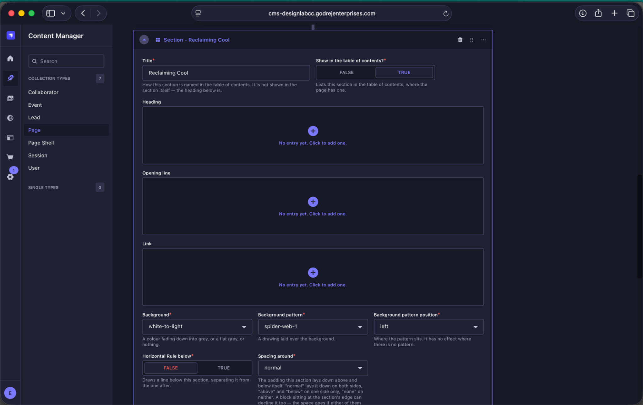
Theme pattern controls. Choose the pattern treatment for that year, then set its colour, position and rotation.
Inside the section, the Image stack and content component contains three images alongside the theme copy.
| Quantity | 3 images |
| Upload dimensions | 1664 × 1248 px each |
| Format | JPEG |
| Aspect ratio | 4:3 |
| Composition note | Keep the main subject away from the edges because adjoining images overlap portions of the frame. |
| Upload rule | Upload each image under Small Screens only. The same upload is used across devices. |
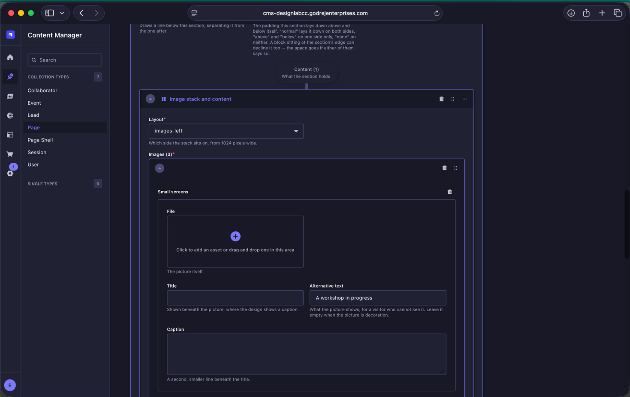
Theme image stack. The component contains three images. Each image supports layout-specific image fields, alternative text, title and caption.
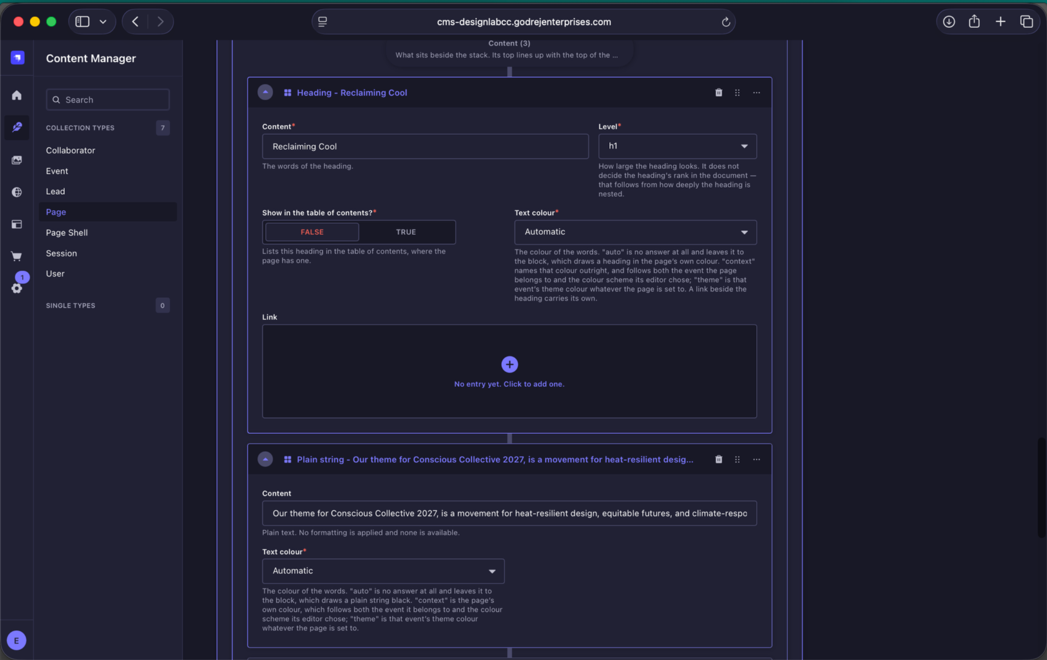
Theme copy fields. Update the theme heading and the two supporting paragraphs while retaining the existing Image Stack and Content structure.
8.5 Session Category Sections
The next four sections are fixed in this order: Showcases → Experiences → Conversations → Workshops. Do not interchange them.
Each category section contains a heading, opening line, View All link, section styling controls and a Session Listing component. The Session Listing determines which category appears, how many sessions are shown and the card hover treatment.
Showcases
- Background: showcase-to-light
- Background Pattern: none
- Heading / link colour: white
- View All: /showcases
- Sessions shown: 6
- Style and transition: change-stroke-on-hover
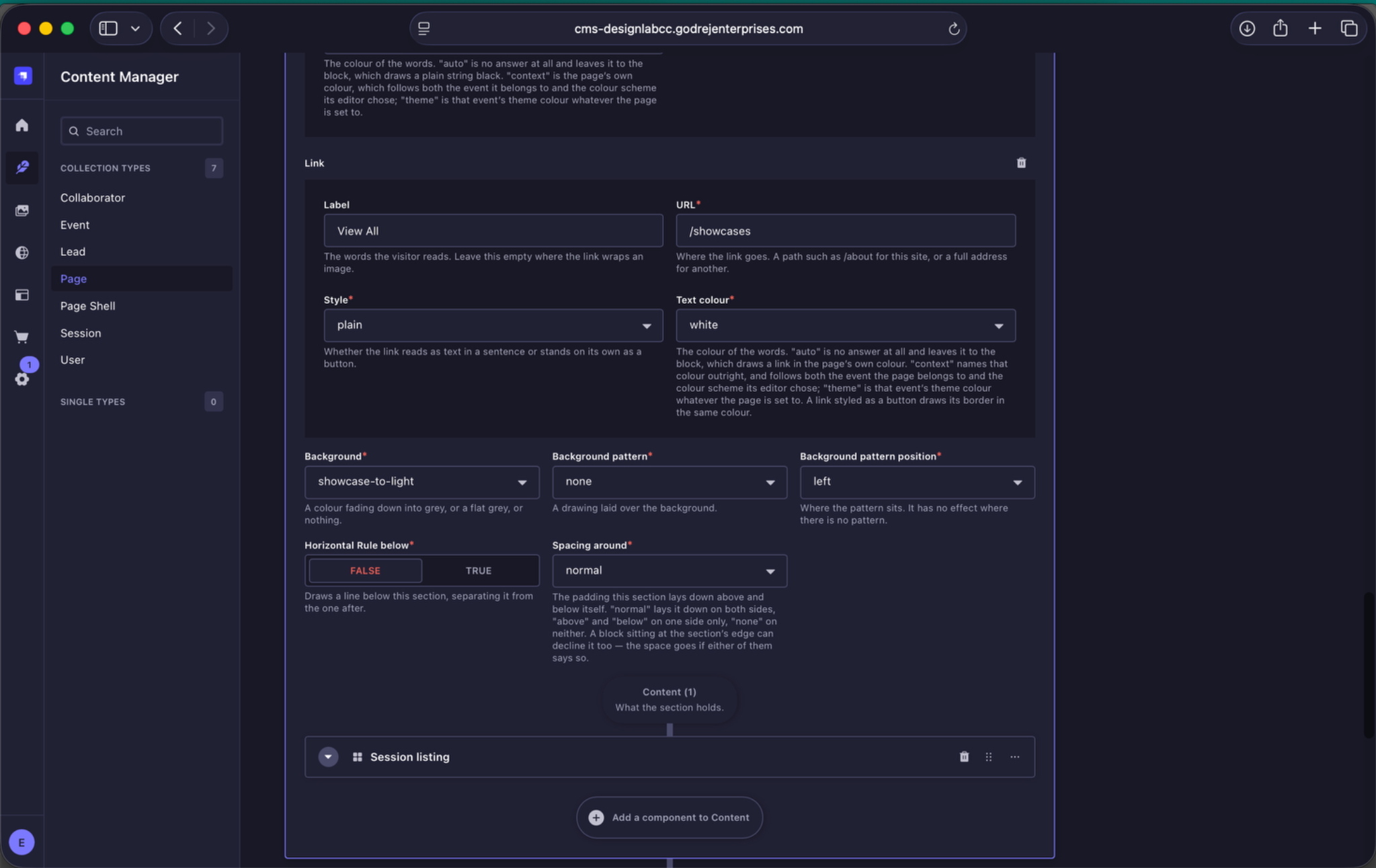
Showcases section controls. The section uses the Showcase colour system and displays six Showcase sessions.
Experiences
- Background: Light
- Background Pattern: none
- Heading / link colour: black
- View All: /experiences
- Sessions shown: 3
- Style and transition: change-fill-on-hover
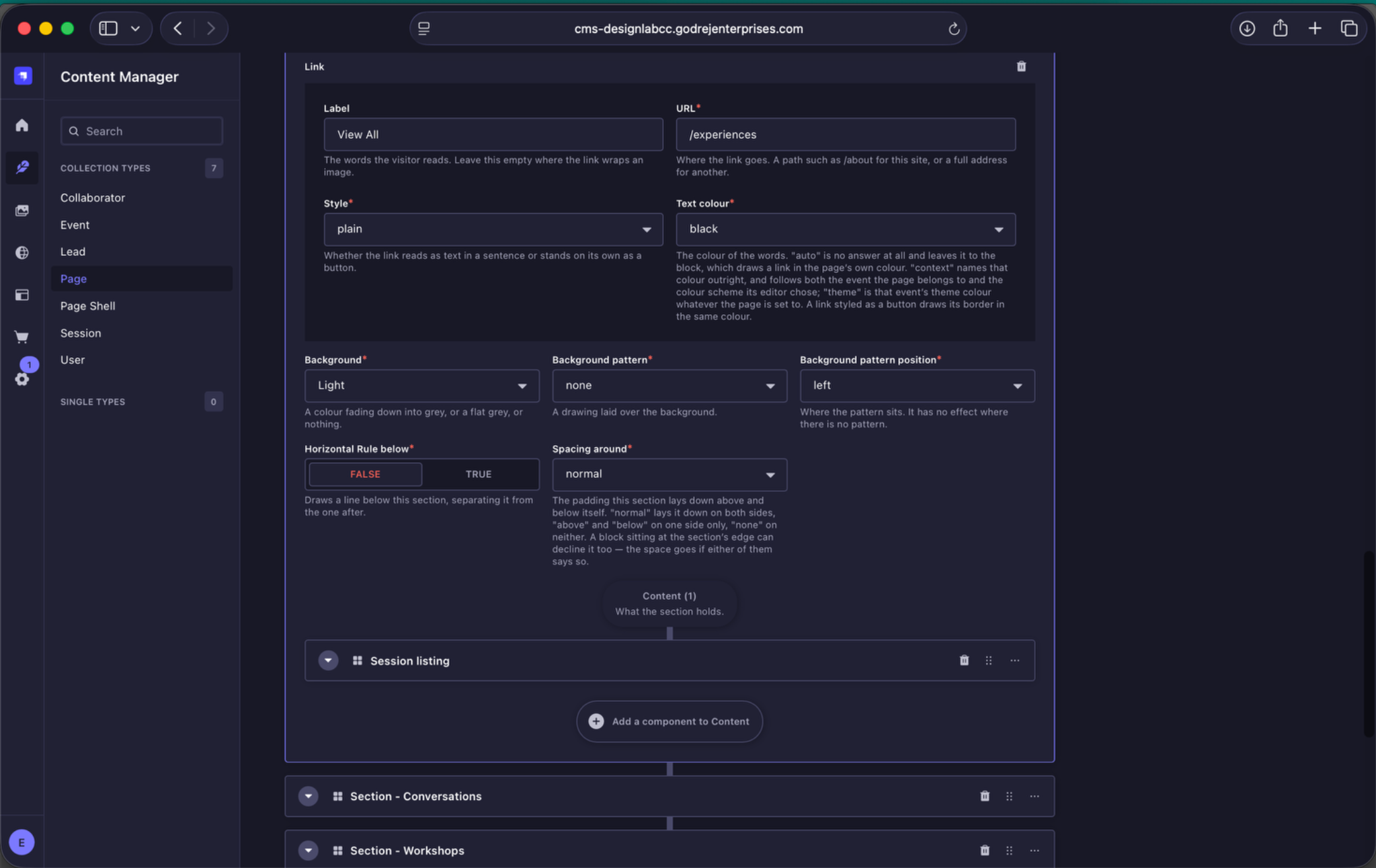
Experiences section controls. The section uses a Light background and displays three Experience sessions.
Conversations
- Background: conversation-to-light
- Background Pattern: spider-web
- Pattern Colour: white
- Pattern Position: top-right
- Pattern Rotation: 90°
- Heading / link colour: white
- View All: /conversations
- Sessions shown: 5
- Style and transition: change-stroke-on-hover
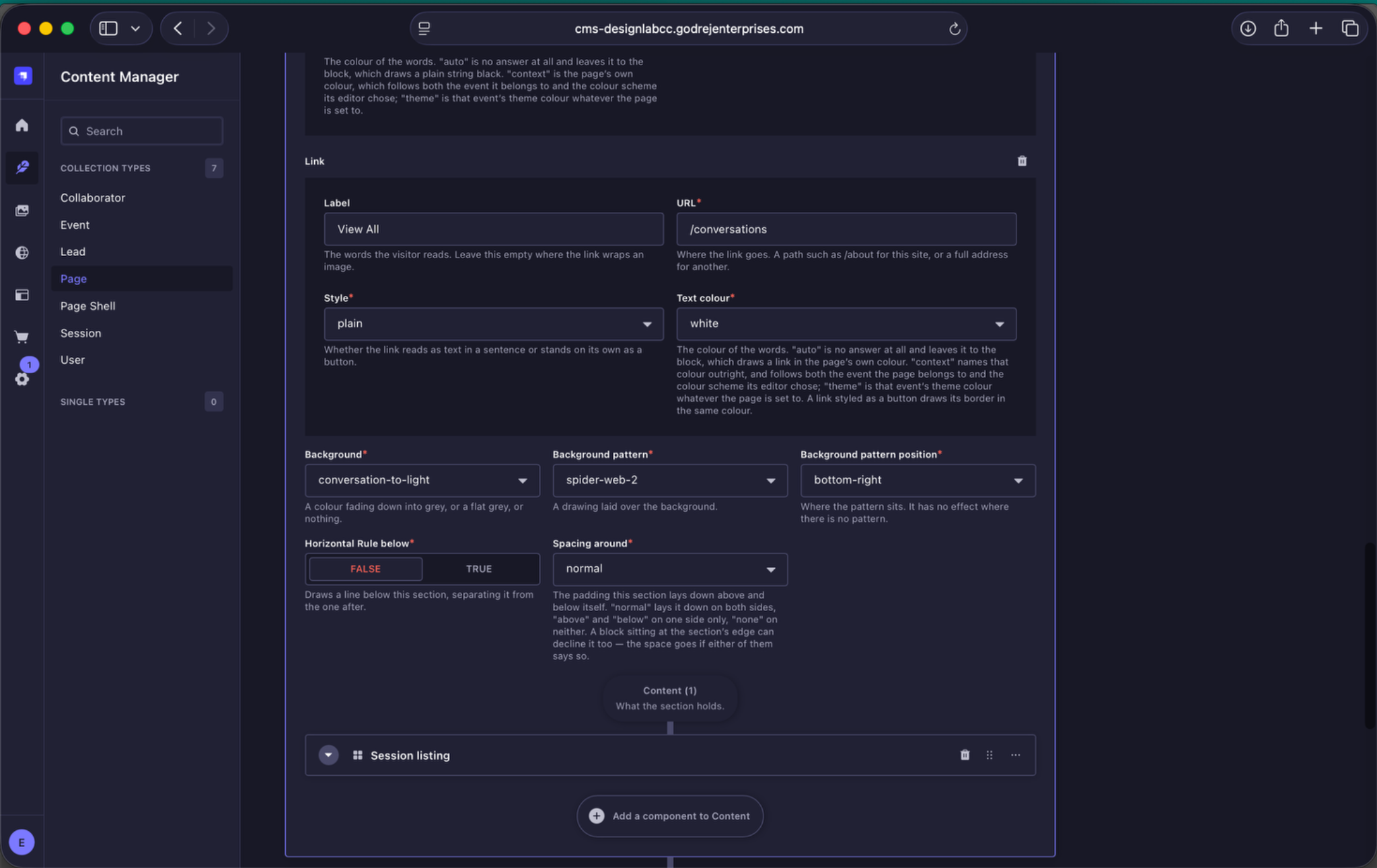
Conversations section controls. Conversations uses the current spider-web background treatment and displays five Conversation sessions.
Workshops
- Background: Light
- Background Pattern: spider-web
- Pattern Colour: black
- Pattern Position: left
- Pattern Rotation: 180°
- Heading / link colour: black
- View All: /workshops
- Sessions shown: 4
- Style and transition: change-fill-on-hover
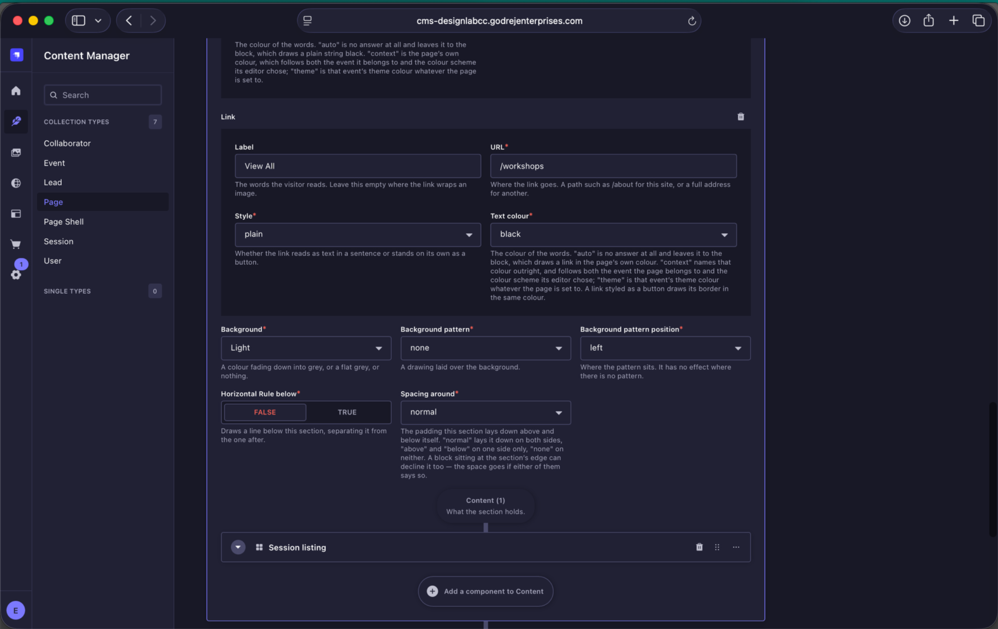
Workshops section controls. Workshops uses the current pattern treatment and displays four Workshop sessions.
8.6 Collaborators
The Collaborators section controls the featured collaborator carousel on the Home Page.
- Heading: Collaborators
- Opening line: The people who made this year's programme.
- View All link: /collaborators
- Heading / link colour: white
- Background: contributor-to-light
- Pattern: the annual pattern installed in the backend
- Pattern colour: white
- Pattern position: left
- Pattern rotation: 270°
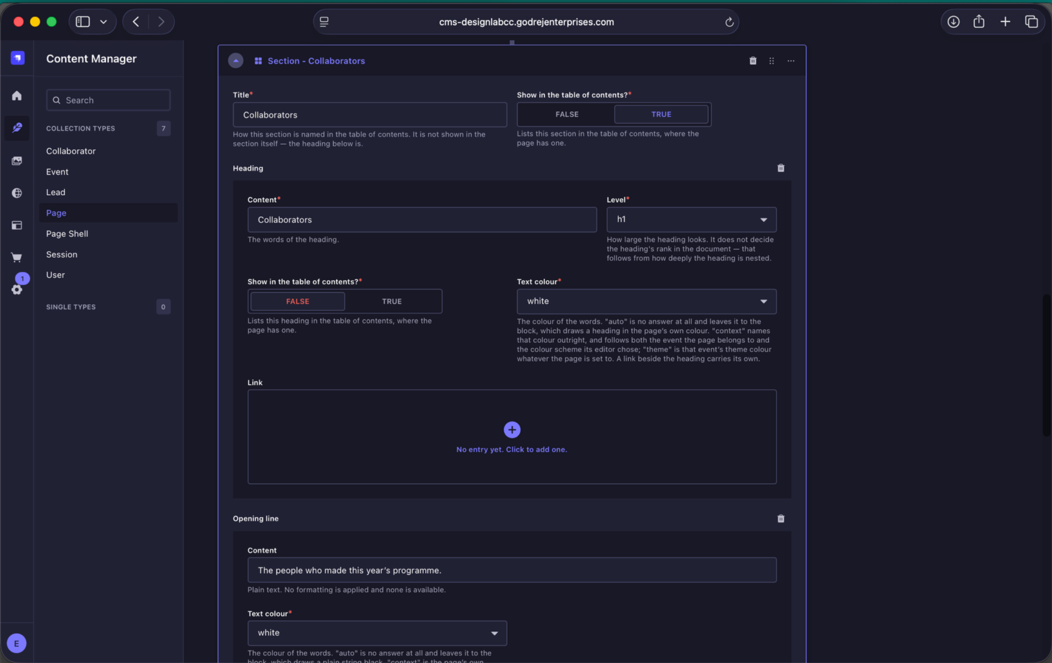
Collaborators section content. Update the heading, opening line and View All link while keeping the section connected to the Collaborator Listing component.
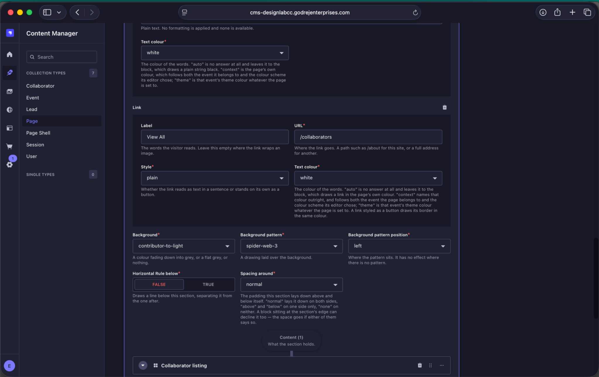
Collaborators section and listing. The current Home Page uses the contributor-to-light background and the annual pattern treatment, followed by a Collaborator Listing set to carousel.
Inside Collaborator Listing:
- Layout: carousel
- How many: up to 10
- Collaborators: manually select the collaborators to feature and arrange them in the order they should appear.
If the Collaborators relation is left empty, the listing can fall back to collaborators associated with the page's Event, up to the number set in How many.
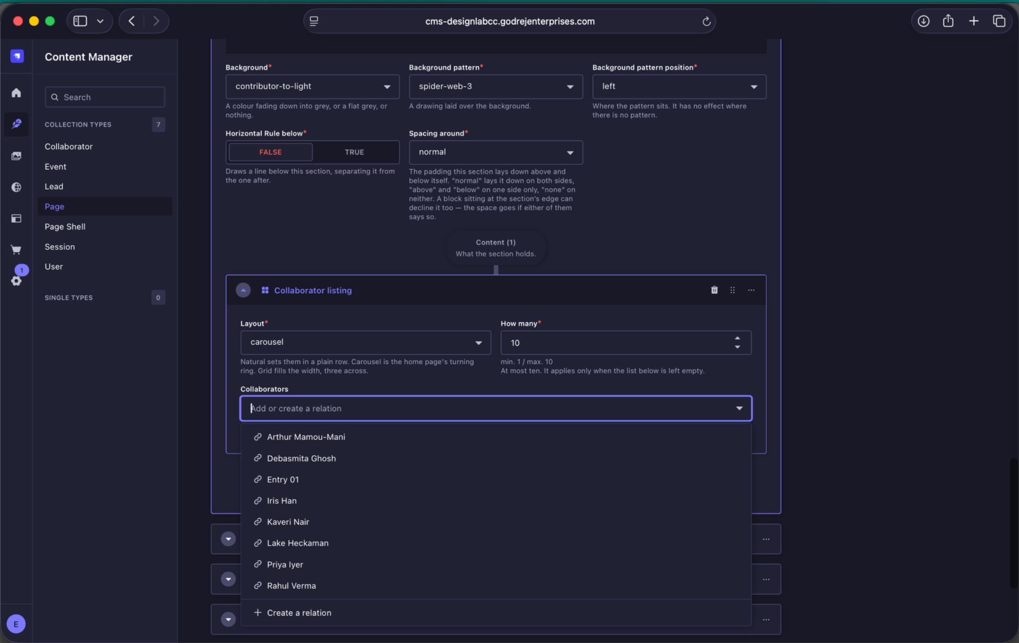
Selecting collaborators. Use the relation field to choose the featured collaborators for the Home Page carousel and control their order.
8.7 The Archives
The Archives section links to the full Archive Page and displays past editions in a carousel.
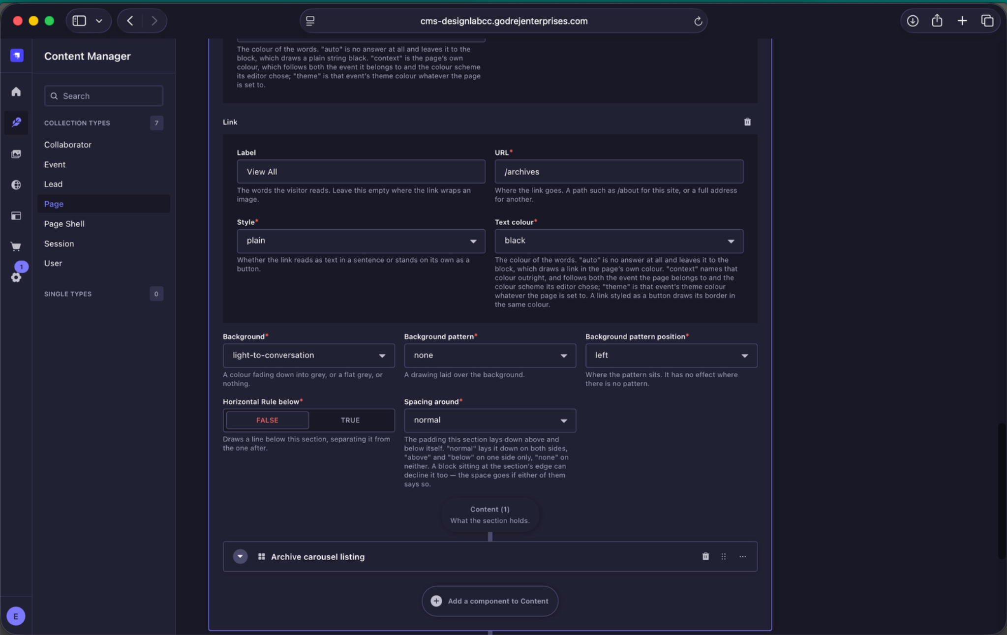
Archives section controls. The section contains the Archive Carousel Listing and links through to the full archive.
Desktop and mobile use different aspect ratios, so a dedicated mobile crop may be required.
| Desktop / Medium Screens | 2304 × 1152 px, JPEG, 2:1 |
| Mobile / Small Screens | 1080 × 1080 px, JPEG, 1:1 |
| Upload rule | If the desktop image does not crop well to a square, upload a dedicated Small Screens version. Large Screens can remain empty unless a different crop is required. |
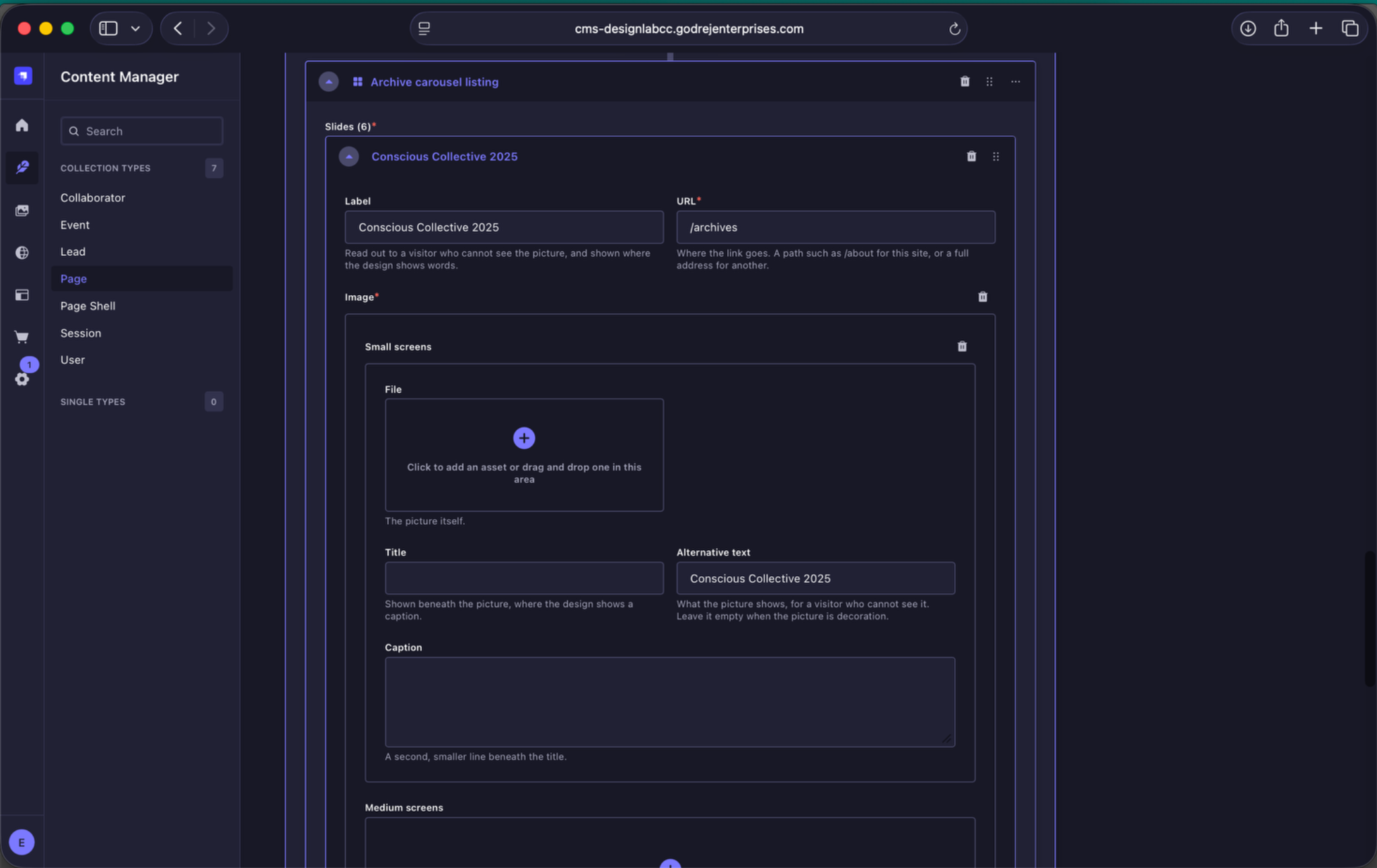
Archive carousel image fields. Small Screens uses the square mobile crop, while Medium Screens carries the wide desktop image. Large Screens can be left empty unless another crop is needed.
8.8 Follow our Instagram
This is a manually curated section, not a live Instagram feed. For each featured item, upload a thumbnail and add the corresponding Instagram post or Reel URL manually.
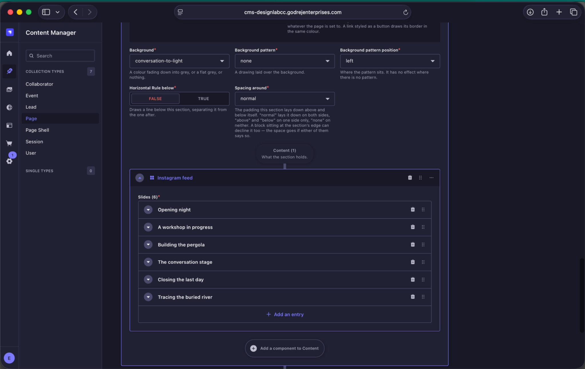
Instagram section controls. The section links to the Godrej Design Lab Instagram profile and contains a manually curated Instagram Feed component.
| Thumbnail | 1080 × 1350 px |
| Format | JPEG |
| Aspect ratio | 4:5 |
| URL | Add the corresponding Instagram post or Reel link. |
| Alternative text | Describe the image for accessibility. |
| Upload rule | Upload the master under Small Screens. Use Medium or Large Screens only if a different crop is required. |
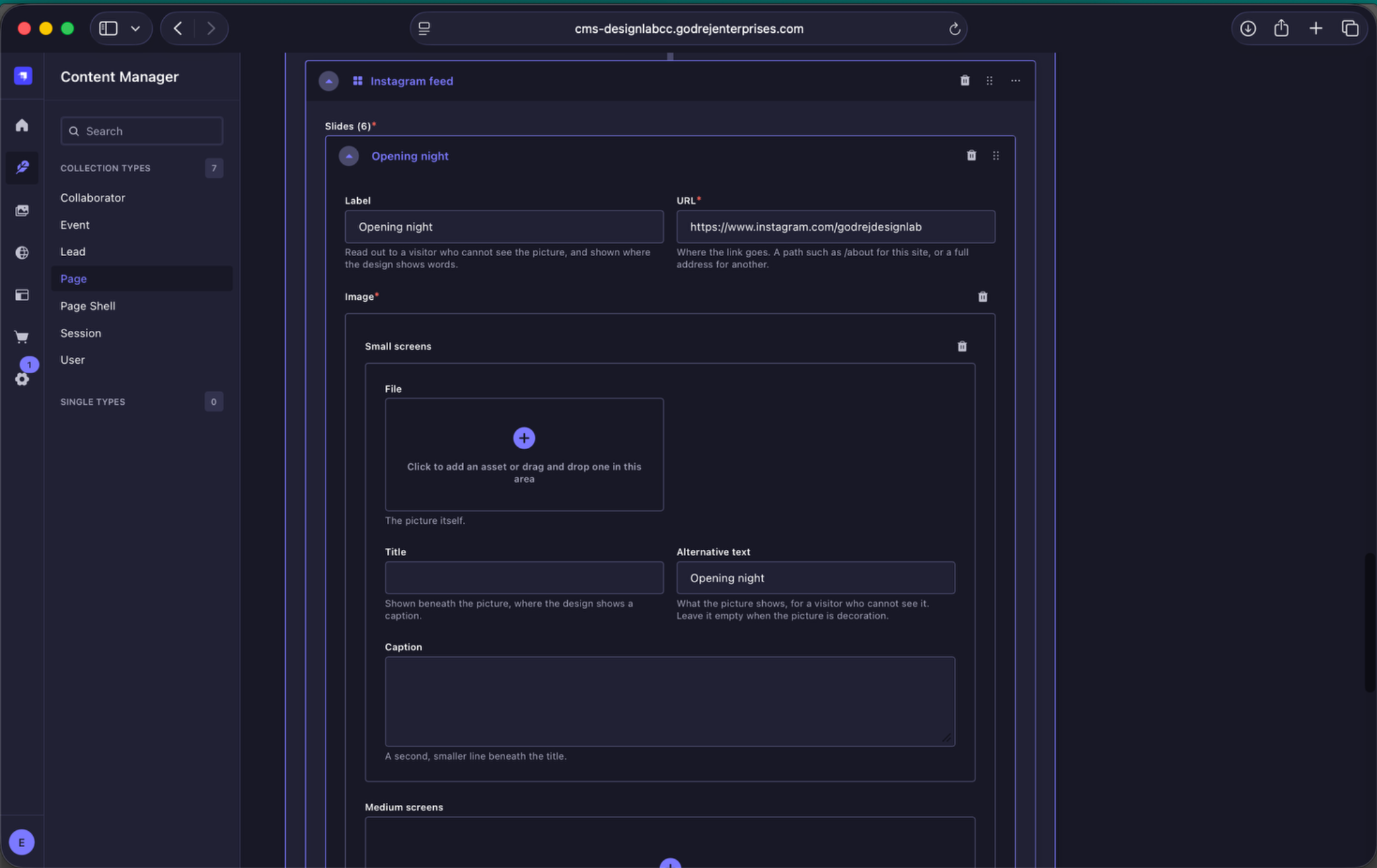
Instagram feed slide. Each curated item contains a label, Instagram URL and thumbnail image.
8.9 Sponsors
For each sponsor, add the sponsor name, logo and alternative text.
| Format | PNG with a transparent background |
| Minimum dimensions | 250 px wide or 250 px high, depending on logo orientation |
| Upload size | Use the minimum dimensions above. No additional scaling is required. |
| Colour treatment | Upload the logo in its original colours. The website applies the greyscale treatment. |
| Crop | Remove unnecessary transparent space around the logo before upload. |
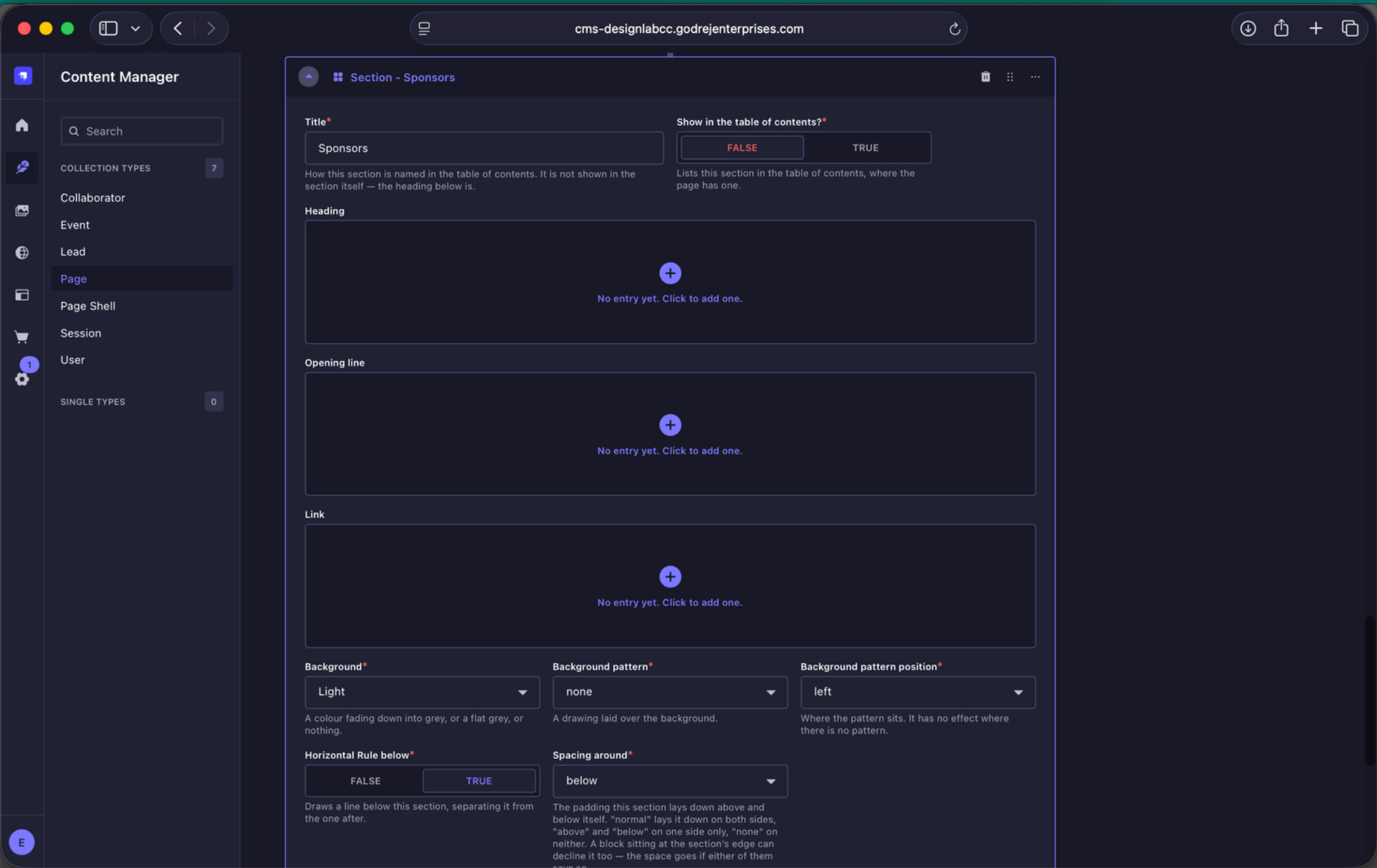
Sponsors section controls. The Sponsors section contains the sponsor list for the current annual edition.
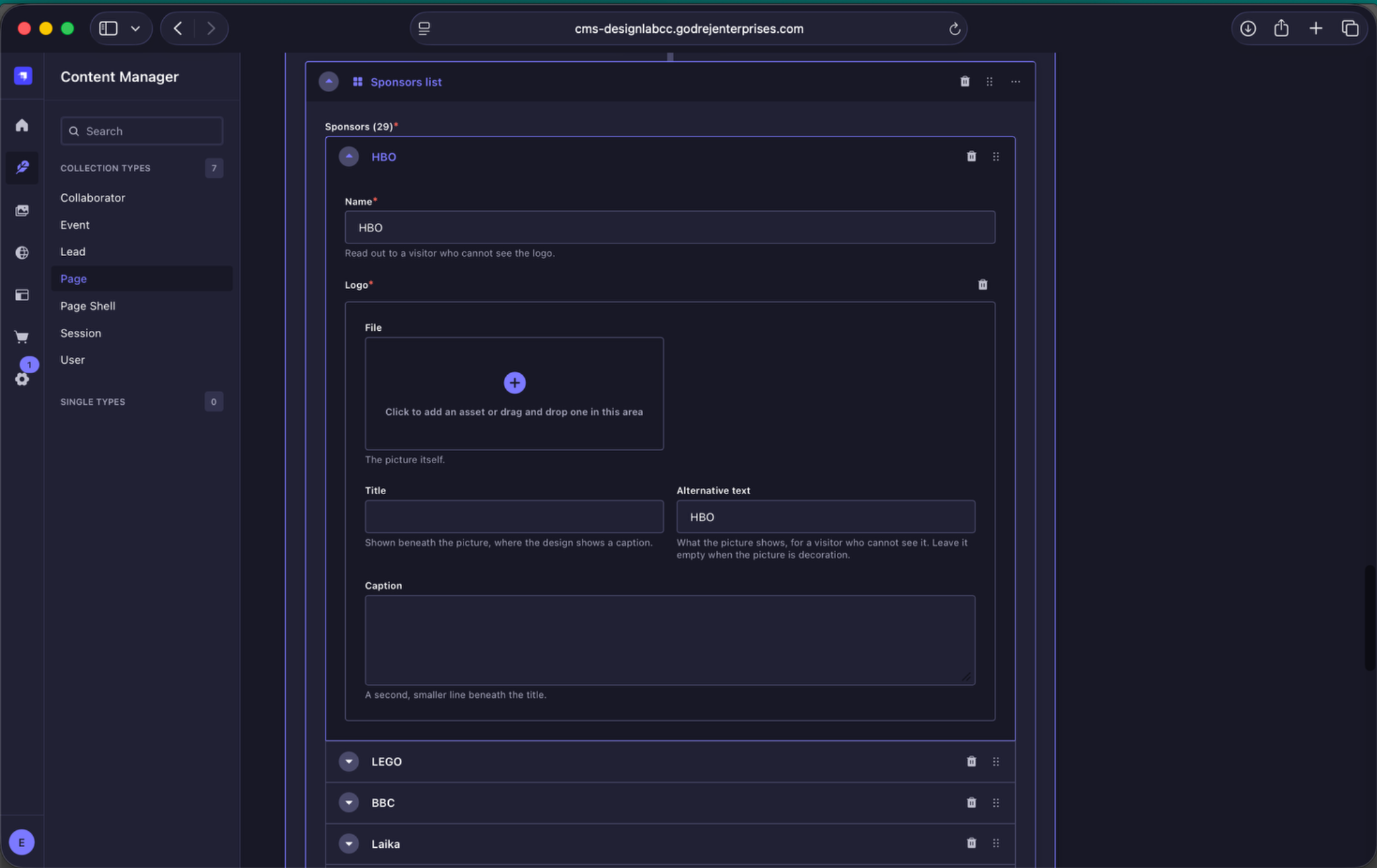
Sponsor entry. Each sponsor requires a name and logo. Add meaningful alternative text wherever the logo is not purely decorative.