
05. Managing the Annual Event
Go to Content Manager → Event. The Event entry controls the annual edition of Conscious Collective, including its dates, registration state, downloadable schedule and visual system.
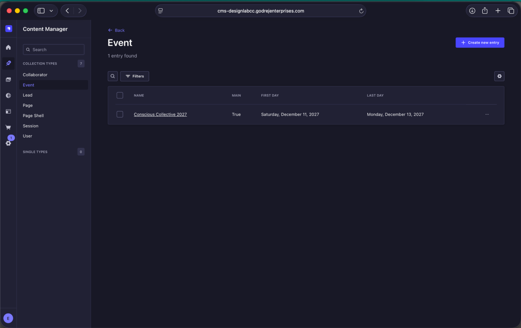
Annual event listing. Open the current annual event, for example Conscious Collective 2027. The Main column identifies the edition currently being promoted on the website.
5.1 Event Settings
At the top of the Event entry, configure the annual event details:
- Name - the annual event name, for example Conscious Collective 2027.
- Main Event - set to True for the edition currently being promoted. The website header and footer follow the event marked as Main.
- First Day / Last Day - the start and end dates of the annual event.
- Archived - mark a past edition as archived rather than deleting it.
- Opens At / Closes At - the earliest opening time and latest closing time used across the event.
- Schedule Document - upload the downloadable programme PDF for that edition.
- Registrations Are Open - controls whether registration is available while this is the main event. When switched off, the registration CTA is removed from the relevant website locations.
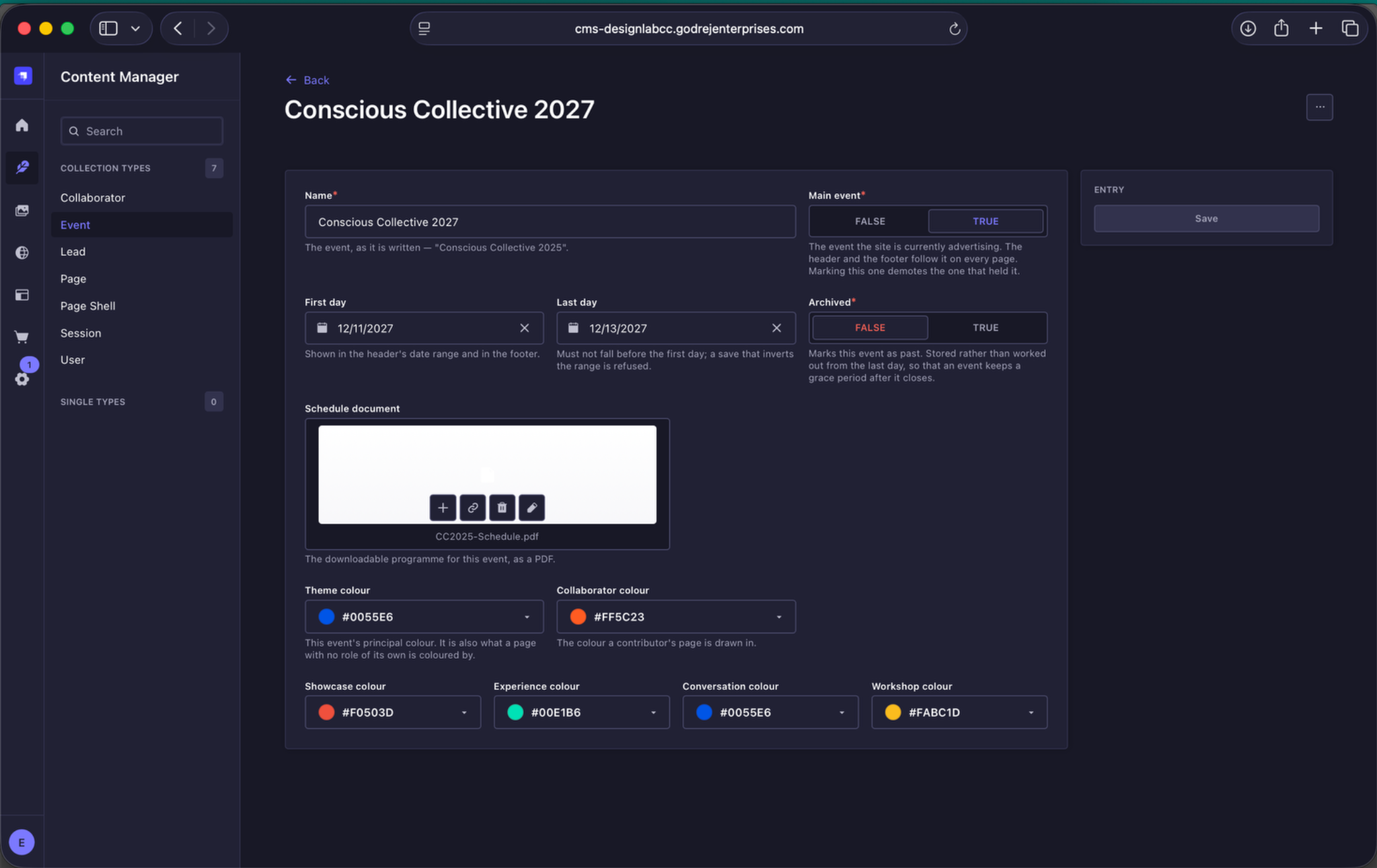
Annual event settings. The top of the Event entry contains the annual edition name, Main Event status, dates, opening and closing times, archive status, schedule document and registration state.
5.2 Colour System
Each annual Event has its own visual system. Colour groups are available for the overall Theme, Collaborator content and each programme category - Showcase, Experience, Conversation and Workshop.
Each colour group contains a Base Colour. This acts as the fallback colour for that group. If an individual button-state colour is left empty, the website falls back to the Base Colour.
Button colour controls
For each programme category, editors have full control over the colours used by both outline buttons and solid / filled buttons. These can be set independently for the following states:
- Outline button border - at rest, on hover and pressed.
- Outline button text - at rest, on hover and pressed.
- Solid button border - at rest, on hover and pressed.
- Solid button fill - at rest, on hover and pressed.
Hover states apply only on devices that support a pointer, such as a mouse or trackpad. A tap on a phone does not display the hover state.
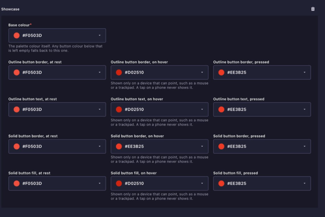
Showcase colour controls. The Showcase palette includes a Base Colour plus independent colours for outline and filled button states.
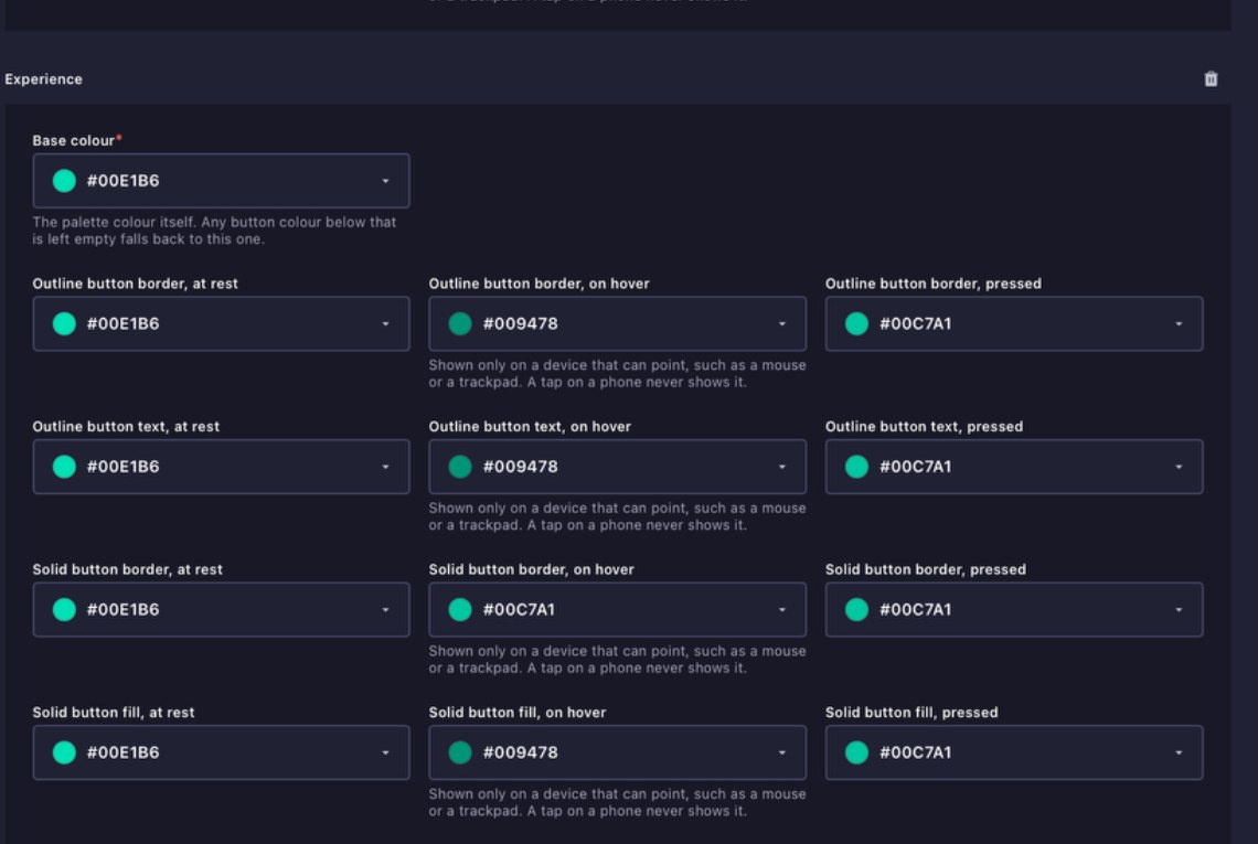
Experience colour controls. Set the base palette and the rest, hover and pressed states for outline and filled buttons.
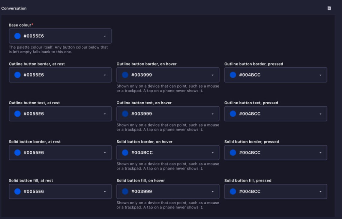
Conversation colour controls. The Conversation category has its own complete button colour system independent of the other categories.
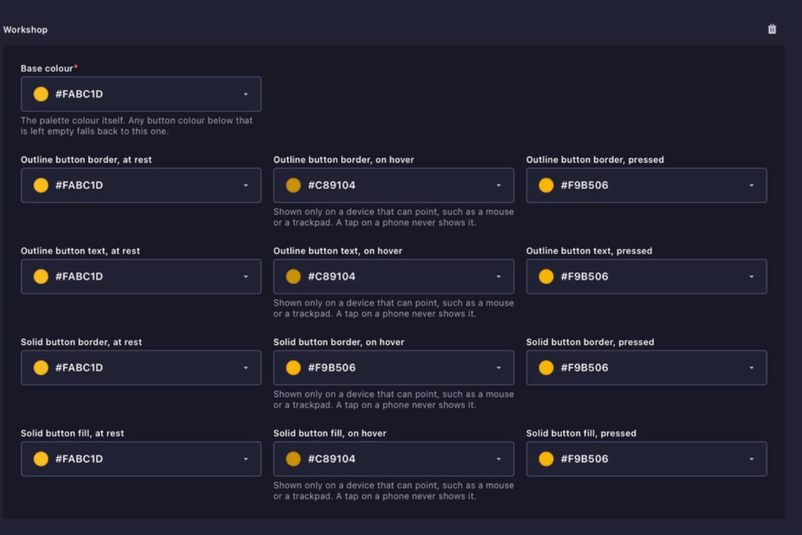
Workshop colour controls. The Workshop category can independently control its Base Colour and all outline and filled button states.
Event controls the annual setup. Sessions control the individual programme content that sits within that event.