
04. List of Content Blocks
Content blocks are the reusable building pieces available inside a page or Session section. They can be combined in different ways depending on the content being presented. The blocks are grouped in Strapi under Text, Navigation, Media, List, Miscellaneous and Container.
Use the simplest block that suits the content. Break longer pages into clear sections instead of placing too much material inside a single section. Once you finish editing a section, close it before moving on so that the nested backend remains easy to navigate.
4.1 Text Blocks
Heading adds a heading within the section. Use the heading level that matches the page hierarchy. Where available, the block can also control whether the heading appears in the table of contents, its text colour and an optional link.
Plain string is intended for short, unformatted text. Use it when rich-text formatting is not required.
WYSIWYG is the main rich-text editor for paragraphs, links, lists and other formatted copy. Use this for most editorial body copy.
Quote is used for a highlighted quotation with attribution. Depending on the implementation, it can also include a portrait image.
Marquee is used for scrolling marquee copy. It is primarily used for short practical or promotional text rather than long-form content.
4.2 Navigation Blocks
Link creates a text link or button. Enter the visitor-facing label and destination URL, then use the available style and text colour controls where required.
Image link makes an image act as a link. Add the label and destination URL, then provide the layout-specific image uploads required by the design.
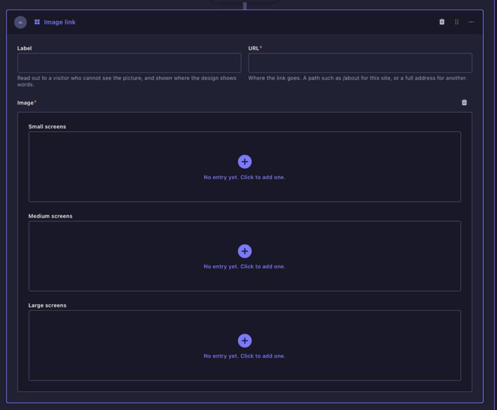
Image Link block. Add the label and destination URL, then upload the image versions required for the relevant breakpoints.
4.3 Media Blocks
Image adds a single image. The block includes the image file as well as optional title, alternative text and caption fields. Use standard image ratios wherever possible and follow the dedicated Image Guidelines for any block with a specified upload size.
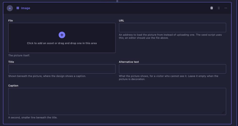
Image block. Use for a standalone image with optional title, alternative text and caption.
Responsive image provides separate image fields for small, medium and large screen breakpoints. Only populate the breakpoints required by the specific design. If a section guide says that one field can be inherited across sizes, follow that page-specific instruction.
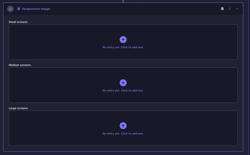
Responsive Image block. Separate fields allow images to be supplied for small, medium and large screens where different crops are needed.
Full-bleed image displays an image across the full content width. It also provides small, medium and large image fields together with a spacing control. Follow the page-specific Image Guidelines for the recommended crops.
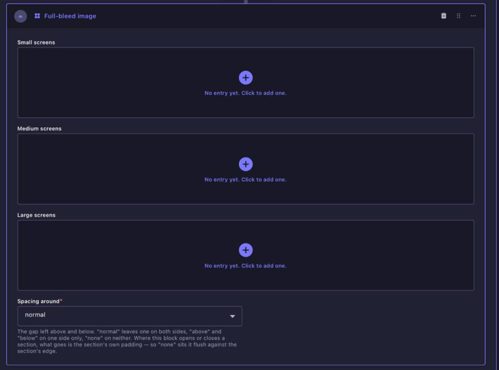
Full-bleed Image block. Use when an image needs to span the available page width. Populate only the breakpoints required by the design.
Gallery displays two or more images together. The current layout options are equal and wide-first. Equal gives both images the same width, while wide-first gives the first image more space.
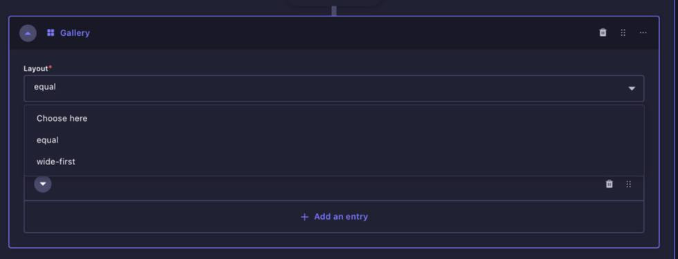
Gallery layout options. Choose equal for evenly sized images or wide-first when the first image should carry more visual weight.
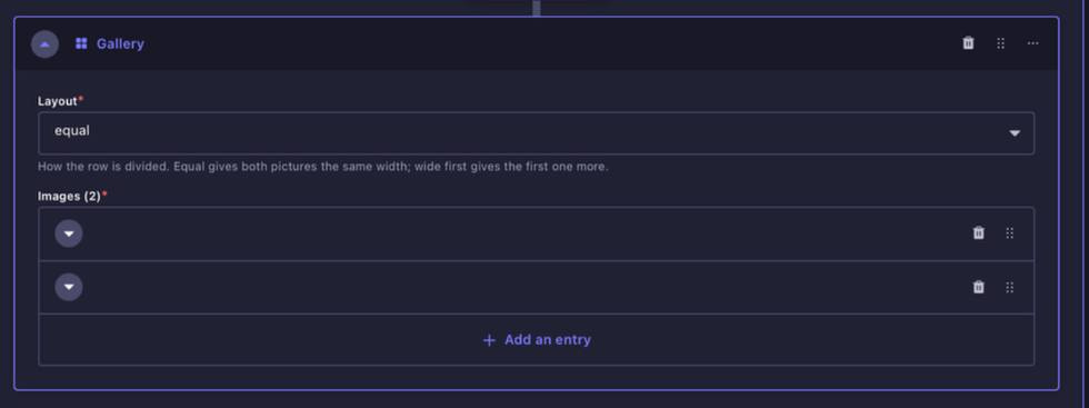
Gallery image entries. Add the images in the order they should appear.
Map creates a map from a Google Maps place URL and zoom level. Copy the long Google Maps URL from the browser address bar, not the short Share link. An optional image can also be added where the design supports it.
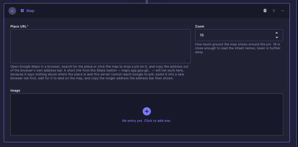
Map block. Paste the long Google Maps place URL and set the zoom level. Do not use the shortened Share link.
Carousel contains repeatable slides. Each slide can include a label, destination URL and layout-specific image fields. Keep slide dimensions consistent within the same carousel.
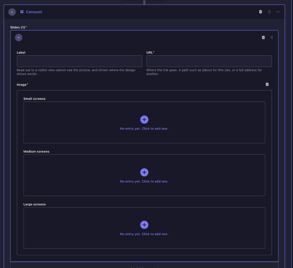
Carousel block. Add slides in sequence and keep the image treatment consistent across the carousel.
Instagram feed is a manually curated set of Instagram items. It is not a live Instagram feed. Add the selected thumbnails and link each item to the correct Reel, image or post.
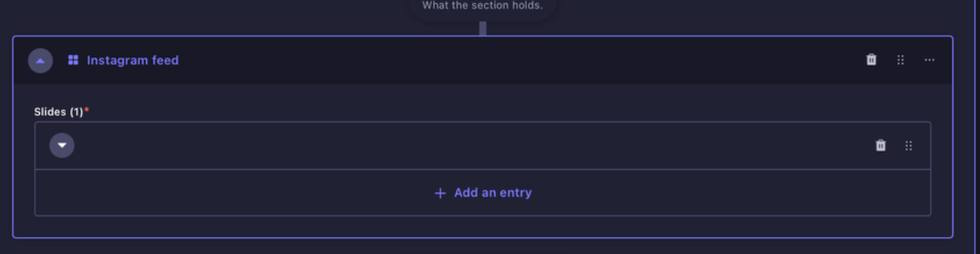
Instagram Feed block. Add curated entries manually. The website does not automatically pull the latest posts from Instagram.
4.4 List Blocks
Sponsors list is a repeatable list of sponsor entries. Each sponsor contains a name and logo image. Sponsor logo preparation is covered in the Image Guidelines.
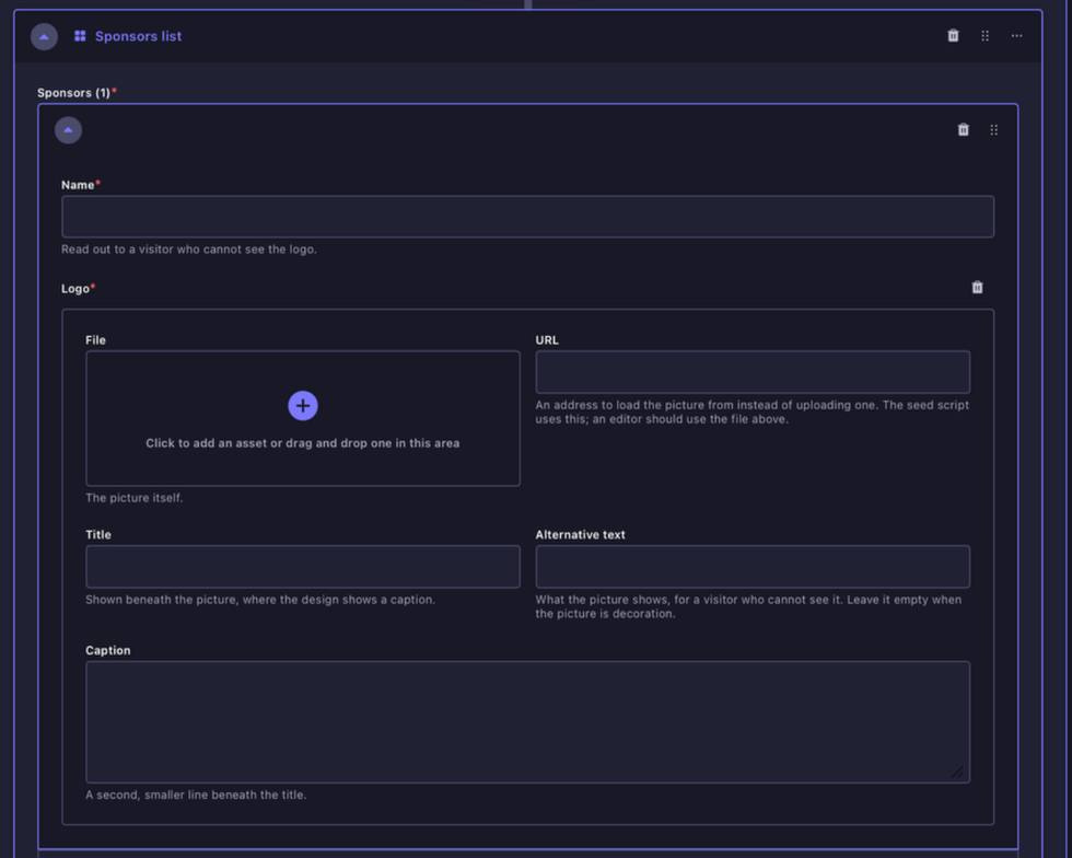
Sponsors List block. Add one entry per sponsor with the sponsor name and prepared logo artwork.
Archive carousel listing powers the archive carousel treatment used on the Home Page. Add the archive slides in the required sequence and populate the fields within each entry.
Archive Carousel Listing. Use for the horizontally scrolling archive carousel.
Archive timeline listing builds the year-by-year archive timeline. Each entry contains the information for one annual edition, including its year, title, description and featured image stack.
Archive Timeline Listing. Add one entry for each annual edition that should appear in the archive timeline.
Profile list is a repeatable profile block containing a person’s name, role, description and portrait. It is used for treatments such as the Core Team on the About Page. This is different from the Collaborator collection and is intended for page-specific profile content.
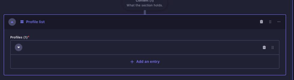
Profile List block. Use for page-specific profiles that are entered directly within the page rather than pulled from the Collaborator collection.
Session list is a manually curated selection of specific Session entries. Choose the Sessions that should appear, arrange them in the required order and use the style and colour-normalisation controls as needed.
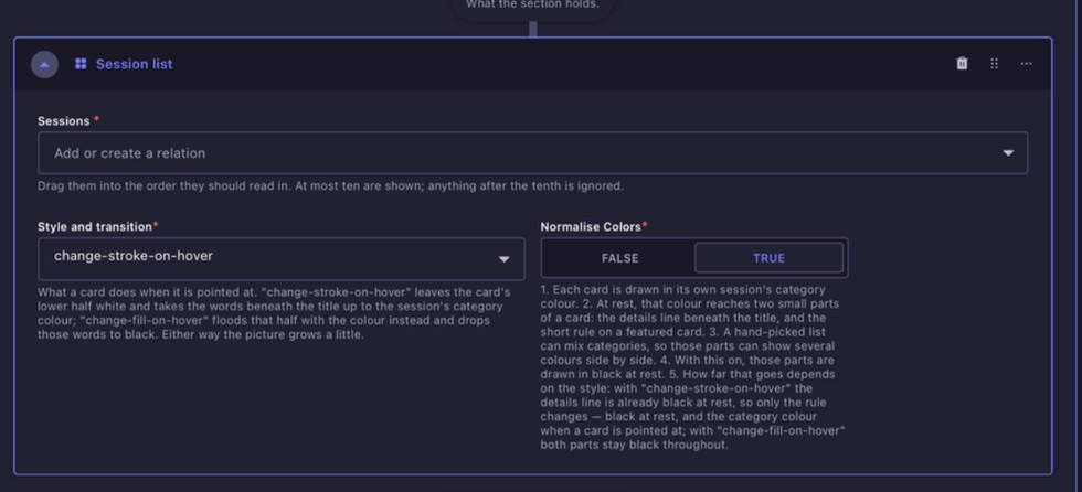
Session List block. Select specific Sessions when a curated list is required rather than an automatically generated category listing.
Session listing automatically pulls Sessions belonging to a selected category. Set the category, the maximum number of Sessions to display and the card transition style. This is used for category sections such as Showcases, Experiences, Conversations and Workshops.
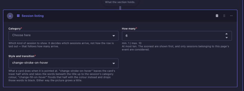
Session Listing block. Choose the Session category, quantity and card transition style.
Session listing with filtration automatically lists Sessions from the selected category and enables the frontend filtering treatment used on category listing pages.
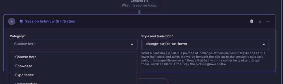
Session Listing with Filtration. Choose the relevant category and card transition style. The frontend filters are driven by Session data.
Session schedule list is the structural block used for the Schedule Page. The schedule itself is populated from Session Instances rather than manually entered inside this block.
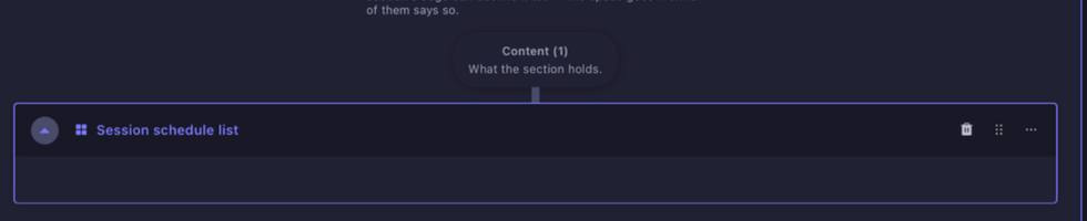
Session Schedule List. This block has no editorial entries to populate. The schedule is generated from Session Instances.
Collaborator listing displays Collaborator profiles. Choose the layout and maximum number of collaborators. Editors can select specific collaborators and order them manually. When the relation is left empty, the listing can populate from the page’s Event up to the number specified.
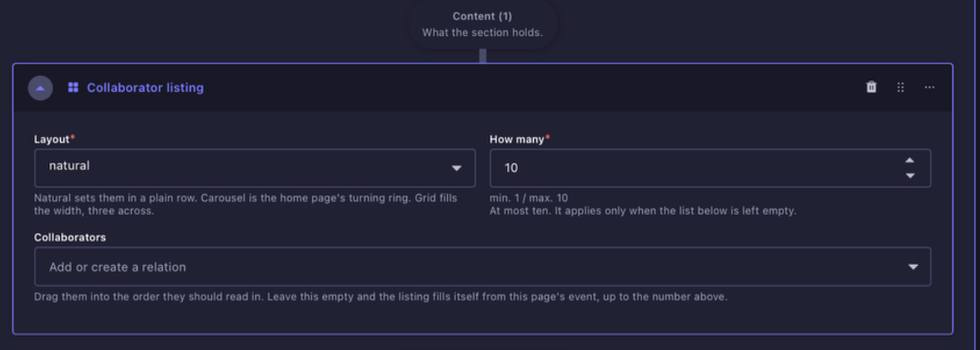
Collaborator Listing block. Choose the layout and quantity, then either select collaborators manually or allow the Event relationship to supply them where appropriate.
4.5 Miscellaneous
Horizontal rule adds a divider line inside a section. The block includes a shade control. Use it only where the design calls for a deliberate visual separation.
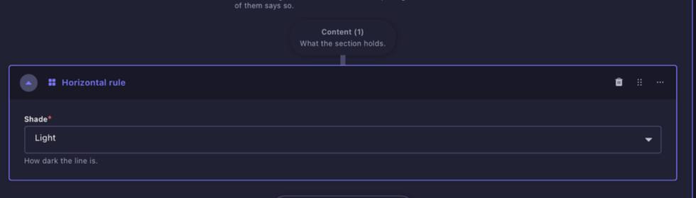
Horizontal Rule block. Choose the line shade and use it sparingly as a visual divider.
4.6 Container Blocks
Container blocks combine media with additional nested content. Because they can contain further components, close the block once you finish editing it so the backend does not become unnecessarily difficult to navigate.
Image and content places an image beside another content area. Choose whether the image sits on the left or right on larger screens. On smaller screens the layout stacks vertically. The image includes the standard title, alternative text and caption fields, and the nested Content area can contain additional supported blocks.
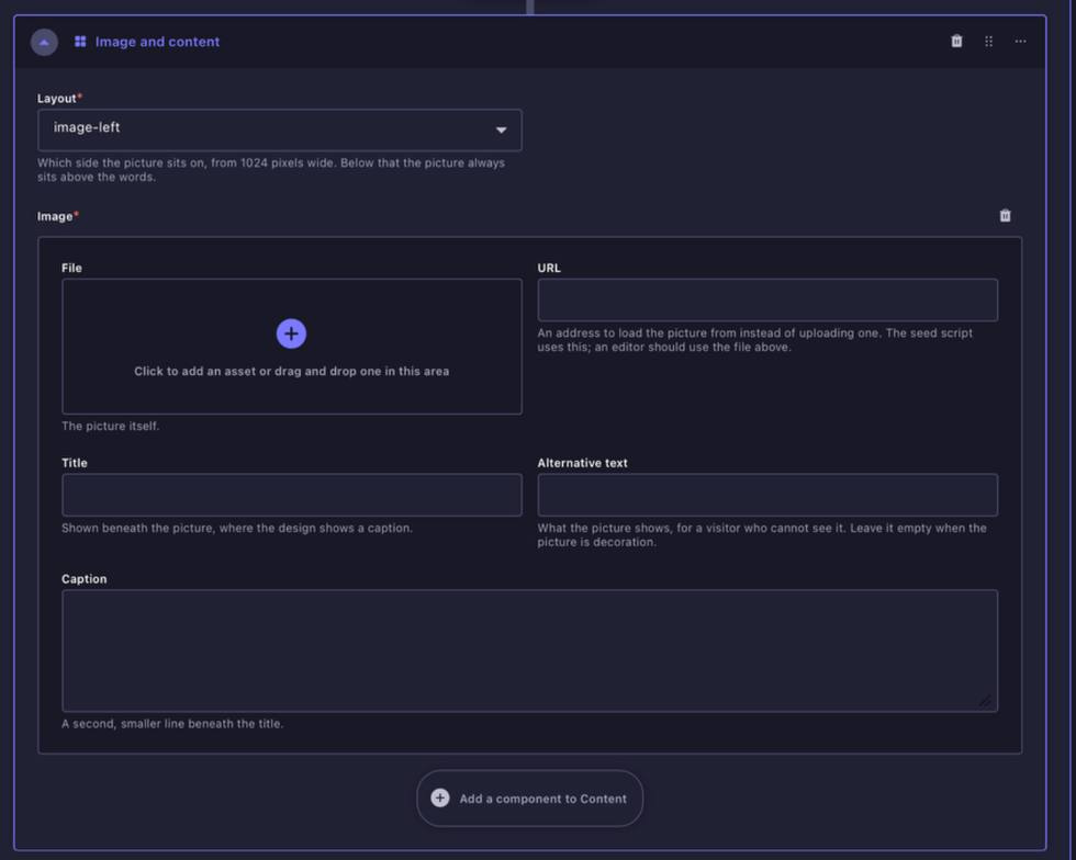
Image and Content block. Choose image-left or image-right, add the image, then build the supporting content inside the nested Content area.
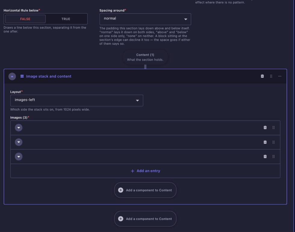
Image stack and content places a stack of images beside another content area. Choose which side the image stack sits on and add the images in the required order. Use the page-specific Image Guidelines where the design specifies exact image dimensions.
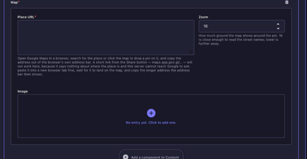
Image Stack and Content block. Add the image stack in order, choose which side it sits on, then populate the supporting nested content.
Map and content places a map beside editorial content. Choose whether the map sits on the left or right, add the long Google Maps place URL and zoom level, and then populate the nested content beside it. An optional image field is also available within the map area.
Map and Content block. Choose map-left or map-right, use the long Google Maps place URL, set the zoom and add the supporting content beside the map.
Image specifications are maintained separately. Refer to the Image Guidelines for upload dimensions, ratios and crop recommendations. The content-block reference explains how the blocks behave rather than repeating every image specification.